Why Your Website Should Use Dithered Images
The average web page has nearly 1MB of images.1
That's a lot of data. More bytes on average than html, css, fonts, and javascript combined.
Worse still, most of these are stock images of people in suits doing business.
Oversized images have a negative impact on your site's speed, accessibility, seo, and on the climate.
Sending unnecessary data down internet tubes is considered bad practice. So, we optimize images with the correct compression, format, encoding, and dimensions.
These methods reduce file sizes without altering the content of the image. The image will look pretty much the same as when you first snapped it. (or downloaded it from unsplash).
But is all that content necessary?
Sometimes, like in the case of a clothing store, or a guide to foraging mushrooms.
But definitely not all the time.
In blogs, and magazines especially, images often serve an illustrative purpose — they reinforce a point in the text.
It's for those instances that I'd like to introduce you to dithering: a method of reducing file sizes in a stylized way.
What is Dithering? #
Dithering is a retro way of reducing the colors in an image for use on old hardware or in print. It removes colors, and strategically place dots to emulate the missing shades.
It's easier to explain with an example…
Here's a picture of my dog taken on a modern smart phone:
123kB
She looks great on our modern devices in full color.
But what if we had to display the same picture on an old black and white computer screen? A screen where each pixel is either off or on. (black or white).
How would we do this? How do we make every pixel in our image either black or white?
The simplest way is to go through each pixel and if it's a light‑ish pixel turn it on, if it's a dark‑ish pixel turn it off.
So, we pick a threshold, some shade between black and white, and if a pixel is lighter than the threshold we turn it on. If it's darker we turn it off.
Easy, but, here's the result: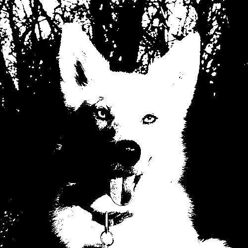
15kB
That looks terrible.
You can still tell it's a dog, but you can't be certain it's my dog.
With just two shades we've lost too much of what makes her recognizable e.g. the contours of her face, her nostrils.
This is where dithering comes in. Dithering simulates all the missing shades with a diffusion of dots.
It swaps pixel brightness with dot density. The denser the dots, the darker the shade.
The next image uses only on and off pixels like the one above, but this time we've dithered it: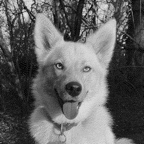
48kB
Examples of dithering and the final image file sizes
30kB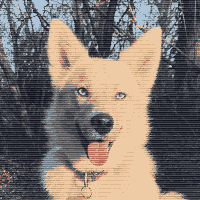
4x1 ordered dithering 12kB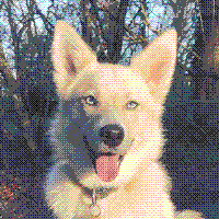
4x4 ordered dithering 14kB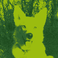
8kB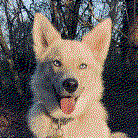
error diffusion dithering in red, green, blue, black, and white 17kB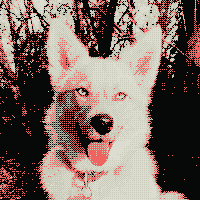
2x2 ordered dithering using the color palette of this website 9kB
That's definitely my dog.
There are many methods of dithering but they all use the same basic principal.
Dithering works with any color palette too. You can apply the same idea above, but for each color in a pixel: red, green, blue.
You don't need to know the specifics of how dithering works to apply it to your website. But if you want to learn more, wikipedia has a good article that covers the different methods.
How does dithering reduce file sizes? #
Dithering turns images that would normally need to be compressed with lossy compression, into images that compress very well with lossless compression.
Lossless Compression #
lossless compression, the type used by png files, works by finding repeated sequences of pixels — then encoding a shortcut for that sequence.
Like if I replaced the word "dithering" in this post, with the letter "d". Then at the top of the post wrote the instruction "dithering=d". That would be a form of lossless compression. None of the information from the original post would be lost.
lossless compression is great when your image has lots of repeating sequences of pixels. But photos with a full range of color have very few (if any) repeating sequences — each pixel is slighly different to its neighbours. So, lossy compression techniques are used instead.
Lossy Compression #
Lossy compression, the type used in jpeg files, is way more complicated. It doesn't work at all like lossless compression. It removes information specifically in ways that are hard for humans to perceive.
jpeg does a really good job compressing photos. It's great if the image contains fluffy real life things like rabbits and clouds.
However, if a jpeg contains stark contrasts and sharp lines, like text, graphics, or dithered images. It fails.
The same lossy compression technique that works on rabbits and clouds, results in weird artifacts in our image and much larger file sizes.
If you'd like to learn more about how jpeg compresses images computerphile have a good video series on it.
A note on file formats #
The original picture of my dog is a jpeg, and the dithered images are png or webp. The file sizes are the result of converting the jpeg to png after dithering.
If the original image was a png it would have a much larger file size. The reduction in size after dithering it would have seemed much more impressive. But the comparison wouldn't have been very useful.
The new-ish image format webp has both lossy and lossless modes, and results in even smaller dithered images.
Why Dither in 2020? #
It's 2020, we've got a lot of problems, but limited colors on computer screens isn't one of them. So, why should you dither images?
- Speed. Large images make your website slow and inaccessible to visitors with slow connections.
- Cost to visitors. Large images cost visitors money, sometimes a lot of money. To put it in perspective, a mobile user in Malawi pays $27.41 per gigabyte in Canada its $12.553.
- Costs for you. Serving large images costs you money too.
- Climate Change. Big images waste electricity and emit carbon. The internet is responsible for
3.7%of global carbon emissions4. A number that keeps growing as we send more and more data. - SEO. Faster loading times and a good user experience will rank your site higher in search results.
When to dither? #
Not every image on the internet should be dithered.
There are times, like in e-commerce, or a photography blog, when images need to be full color. In cases like these it would be daft to dither.
But this is not all the time, not even close.
Would the visitors of your site get more value out of a full color images than dithered images?
Or would they benefit more from faster loading times, and saving money on data?
For this site it's a no brainer.
Some places I'd like to see more dithering…
News Sites and Magazines #
News sites and magazines use images to reinforce writing, or as proof that something really happened. Full color images are usually not needed for this.
Don't know about you, but dithered images wouldn't effect my news consumption at all.
I first learned about dithering from an online magazine, that runs off a solar panel: Low Tech Magazine. Sending dithered images uses less power.
Blogs #
Many blog posts (including this one), start with a big eye-catching image. This is often a stock image vaguely related to the topic.
sterile-office.jpg strong-handshake.jpg sunset.jpg
A reasonable argument could be made that these images should just be deleted. But if you really need to catch eyes...dither them.
How to dither images? #
You can use Dither Me This, a tool I made to dither images.
If you're working with a static site generator. I'm currently working on version of Dither Me This for node that will dither images at build time.
Sources
- HTTP Archive - State of Images
- Computer History – Timeline of Computer History
- Visual Capitalist – Cost of Mobile Data Worldwide
- BBC – Why your internet habits are not as clean as you think
- published
- 19 Dec 2020
- modified
- 30 Dec 2020
- author
- Nathaniel
- tags
postsweb performanceimagesdogdoodad